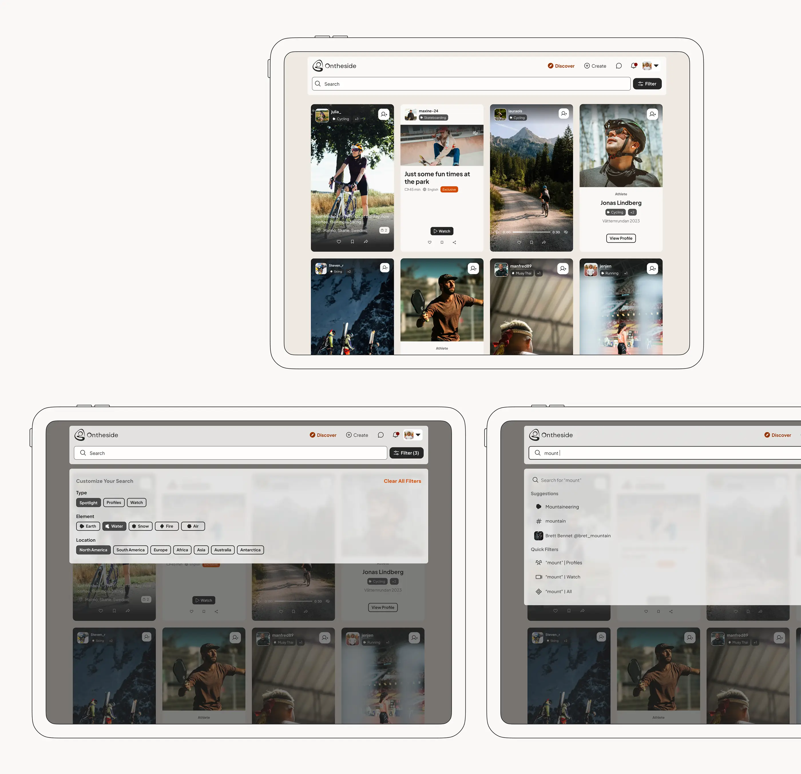
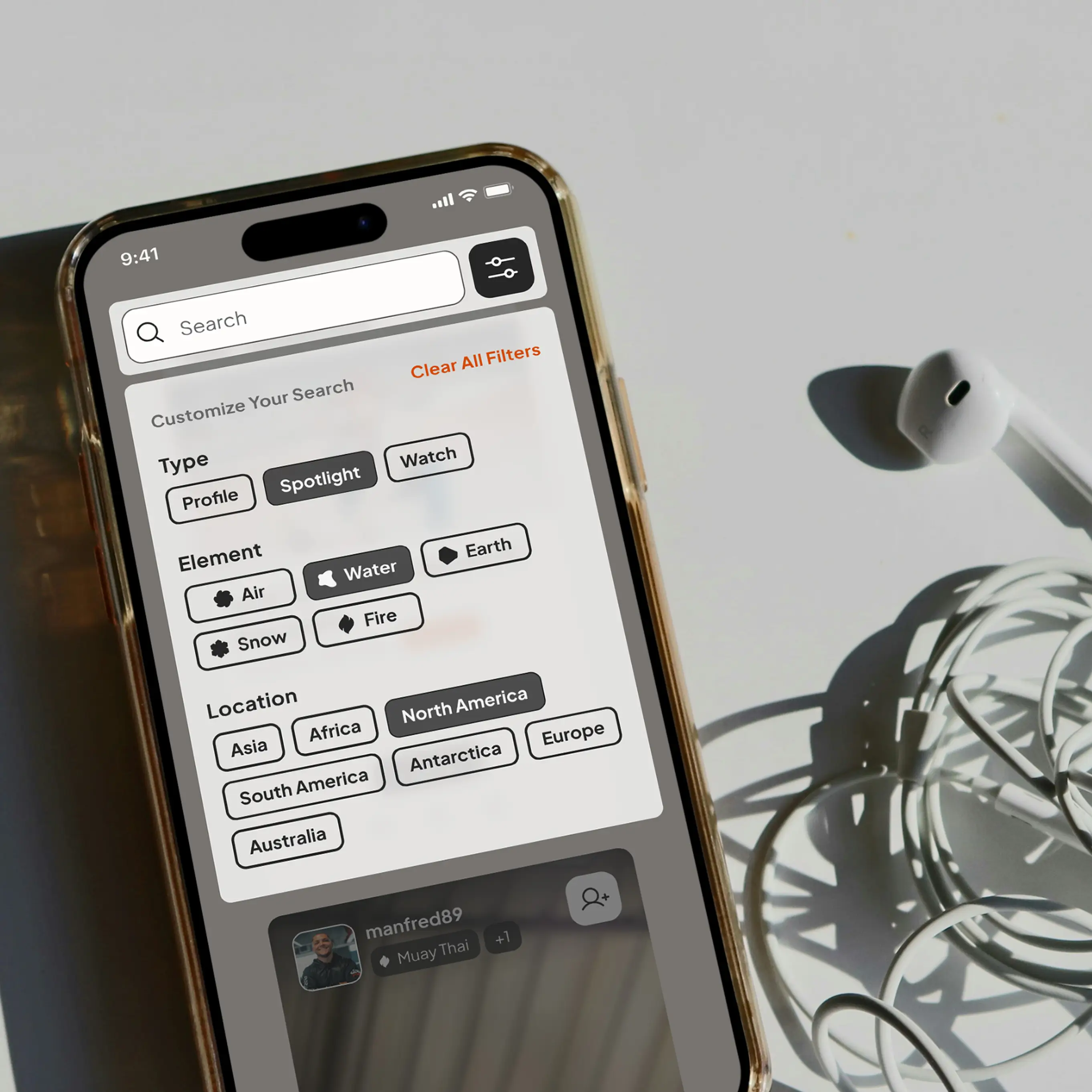
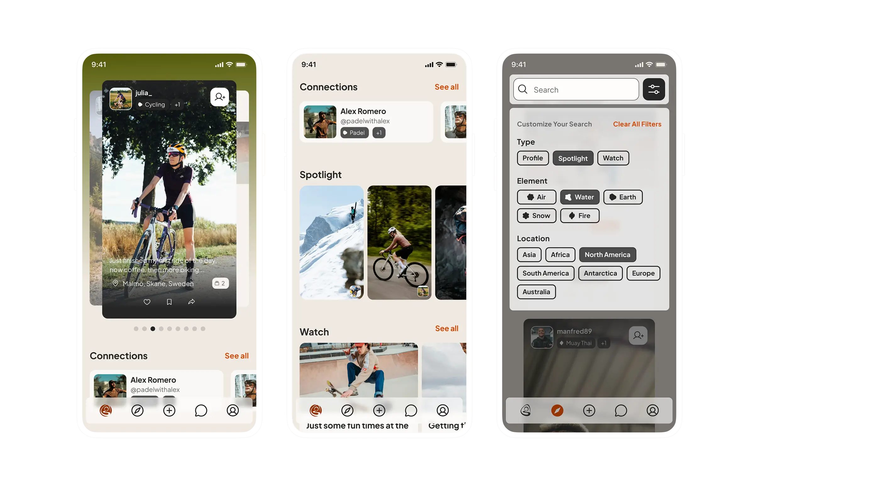
Updating search behaviour and creating a more accessable filter.
Before launch, user testing was conducted to evaluate how users navigated the platform and to identify potential friction points in the experience. The tests revealed that the Discover view was perceived as difficult to navigate, particularly the search and filtering functionalities. The biggest challenge was understanding how the filtering worked and what filters were currently active.
The previous solution was designed with a strong focus on aesthetics and innovation, but this came at the cost of clarity. Many users didn’t realize that a filtering function even existed, and the interface made it difficult to see which filters were active, how to adjust them, or how they affected the search results.
This became one of the major features I was responsible for improving. I started by benchmarking how similar platforms handled search and filtering flows. I also drew inspiration from e-commerce solutions to understand how they structure categories and filters in more user-friendly ways.
Since it was important to maintain the brand’s visual identity and sense of modernity, I designed a search field that visually integrates with the main navigation. It includes a blur effect consistent with the brand language, as well as a microanimation that reveals or hides the field based on scroll behavior.
I also replaced the previously unclear filter icons with a clearly labeled button. When clicked, it opens a filter panel where users can select options using chips. This provides a quick, accessible overview of available filters and active selections, making it easier for users to understand where they are in their search and how to refine it.

.webp)

